Open for Day 19 #100DaysStudioObj

This is an image cut out from New York Times Magazine circa 2002-ish that I used as a piece of my masthead on my website for years. I did a pretty crappy job of cutting it out, there is a drafting dot stuck to the corner and it's a little torn on the other, but I'm happy it has survived all these years. It's a nostalgic object in my studio.
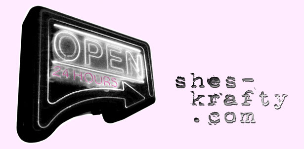
Around the time I cut it out someone had given me a bootleg copy of Photoshop and I self taught myself enough to figure out some basic manipulations, but I was pretty bad at it. I took a picture with my digital camera, downloaded the image and then played around with it. The first version of the masthead was black and white with a hint of pink with some old typewriter font text next to it.
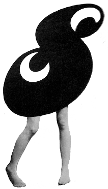
My website was a blog and after short amount of time I decided to change the name to "the shes-krafty diary". I kept the OPEN 24 HOURS but added a pair of seamed stocking legs in strappy sandals. (I used to blog a lot about shoes and shopping and had a big selection of fancy stockings in my wardrobe, so it seemed like a nice fit.)


The legs were from the cover of a vintage pulp fiction novel that I adored (sadly now long gone). Again I put my poor Photoshop skills to work and got rid of the man in the picture as best I could (please read everything into this description). I put the two elements next to each other, rather awkwardly, with the arrow pointing at the legs above the title of my blog.

As time went by my interest in graphic design was growing, along with my Photoshop skills. I figured out the lasso tool and how to crop and colorizing with greater precision. Eventually I stacked the two images on top of each other and although there were tweaks in proportions and typography (grunge type was so over), this general look was my logo for years.
Without question that cut out from 2002-ish influenced my current leggy logo (Day 9).