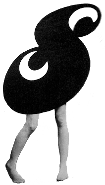
Process heavy poster for Day 17 #100DaysStudioObj for #The100DayProject

One of the pleasures of being part of the management team for Keystone Art Space is generating physical and digital materials for promoting the space and its artists. I actually started doing this long before I worked for the space—when I first became a tenant I volunteered to create a website and to reignite the social media accounts. For the first couple of years I was in the building my involvement in these realms had ebbs and flows of activity and levels of success. Now in a more "official" capacity, my design and promotional work for Keystone continues. All the while it has been a collaboration with Melanie Mandl, Keystone's director. This time around it started with some text messages between the two of us.


For the upcoming Open Studios Melanie and I both agreed the poster and related materials should be a departure from the Fall 2014 event's look. The design had been a success, but it seemed like time to move on. Melanie and I swapped some images via text message of old magazine layouts we both enjoyed (pictured above). I really like the idea of density of information and images fitting within a highly structured grid.
I clicked through some images I keep for inspiration on my computer and was immediately struck once again by the beauty of the in-house designed and risograph printed newspaper for a Martin Creed exhibition. I mocked up some close copies of the design plugging in Keystone information. I kept tinkering away, but finally abandoned the idea. What I was making was too close to the original and I couldn't add any new ideas or modifications that satisfied me as being an improvement.


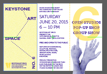
I wanted to emphasize that it was the sixth open studios event at the new location so I searched the internet for some stock images of hands showing 6 fingers and dropped them into the designs as placeholders. Eventually I shot images using my iPhone of my studio neighbor Mark's assistant's hands (outtakes below—he has nice long fingers). I pixelated and recolored the images and again began seeking new ideas for the poster.

My attention turned to the number 6 itself, and I created some mock-ups using a font I purchased that came with many layers for creating 3D effects. But I didn't really love these either—too circus-y and happy-go-lucky. I came back to the hands and began playing around with them again.

I was feeling like it was time to start completely over with the design and Melanie texted me a snapshot of a vintage advertisement that had struck her. Like her, I loved it. I opened Illustrator once again and began a concept based on the ad. I did many iterations over several sittings including changing the original red/gray color palette and eventually got to the finished design.


The finished poster retains some original concepts about following a strict grid and being text and graphic heavy, like a newspaper. I'm pleased with it. I'm sure I will do a few tweaks here and there before the final poster is printed (with map of the studios on the back) and I'll also create different variations for the social media and a postcard—so my work isn't really done, but it feels like another fun, process-heavy design exercise in the can.